Designing for sales not sentiment: the art and science of designing for action
- Amber Craig

- Jan 28
- 3 min read

We all want our content to “look good”, that goes without saying. It’s unlikely you ever worked with a creative team and said, “I don’t care what it looks like, just do it.”
What I will challenge about desiring content that is visually pleasing, is that it is not the most important part of graphic design. That is because art is subjective, and we will all have opinions about art, but graphic design is art and science. Meaning, there is a psychology, a methodology and an intentional reason why elements are placed where they are (in good design).
The good news for you, is that is that the science behind creative design is intended to influence human behaviour and will ultimately help your content perform better. If you are spending money on creative for advertising, promotional campaigns or social media engagement, you should be working with people who understand this.
To give you a quick crash course on designing for sales and action, here are some basic rules of thumb:
Visual Hierarchy
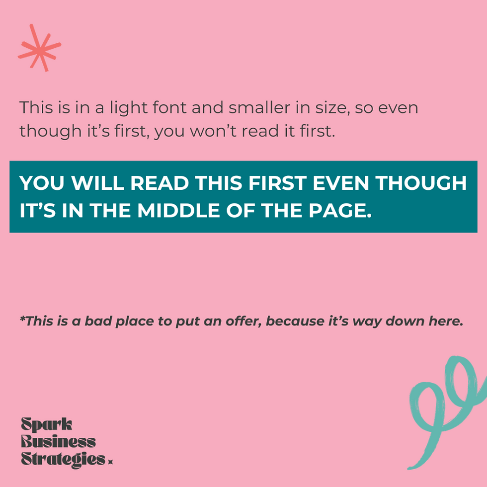
This is a concept built off the fact that humans have a natural desire to create order, whether subconsciously or not. This principle of design includes the organization of elements in a way that will strategically guide the viewer’s eye to content in order of importance.
You can use various elements to achieve visual hierarchy, but given the point is to drive the viewer to content based on order of importance, the first step would be to define what the most important content is. Rank the content pieces in order of importance, and then utilize the following elements:
Composition: readers view from top left to bottom right, so place the most critical pieces of information at the top.
Size: important information should be larger, because items with more weight will gain quicker attention.
Contrast: you can draw attention in with contrasting colours or fonts as well.

Colour Psychology
Certain colours impact human behaviour and colours have different emotional and psychological reactions in people.
“Conversion rates measure the percentage of customers who finish a task set forward by a company. The task may be pressing a call to action (CTA) button or signing up for an email newsletter. Research shows that merely changing the color of CTA buttons can increase conversion rates.” – Masterclass
This is a huge topic to dive into, but to give you some examples that would pertain to designing for sales content:
Red: this colour is associated with energy and can be used to illustrate a sense of urgency. This colour is commonly used to call out sale pricing for this reason.
Yellow: this colour is associated with joy and playfulness, it exudes positive emotional responses.
Blue: this colour is associated with dependability and power.
Fonts Psychology
Yes, there is a psychology behind font choice as well. There are thousands and thousands of fonts, so I won’t go into a ton of detail, but here is a brief overview of how to use this for design.
Bold fonts: use to grab attention and highlight important pieces of information. These fonts are associated with power.
Light fonts: these fonts are associated with gentleness but can be used in contrast with heavier fonts.
Serif fonts: associated with trust, authority and sophistication.
Sans-serif fonts: associated with clarity and cleanliness.
Script fonts: associated with femininity, elegance but are difficult to read.
Alignment
Symmetrical and balanced elements are more visually appealing, making information easier to digest for the viewer. Again, humans are naturally looking to create order, so serve up your designs in a nice balanced way.
Alignment is important whether it be text or other elements in a design. You can play with things like spacing or sizing to achieve alignment as well.
White Space is Intentional
A good designer knows the importance of white space, and your audience does too. White space around elements helps them stand out more, so oftentimes, less is more. White space can help boost clarity and balance in a message.
----
All these design principles are put in place to drive consumer behaviour so it’s important to have a sense of how design works, even if you are not the one doing the design.
If this is sparking any ideas for your business, feel free to get in touch.


Comments